Jobsplane
About Jobsplane
Jobsplane is a job aggregator which helps people across India find the right jobs and internships for them. I worked with the Jobsplane team on an updated brand identity, a redesign of their website, and on the design for their new mobile app.
Identity
The website and branding for Jobsplane had to be modernised without losing the identity users were used to. The challenge was to stick with the same red and grey branding as on the jobsplane.com website, combine it with the material design guidelines to get a cohesive design identity, and apply it across the new website and app. I made the logo sleeker and created a color palette based on the colors used in the logo and website. I also worked on a caped mascot that I used in the brand illustrations.
![]()
The logo, color scheme, mascot and app icon.
Website
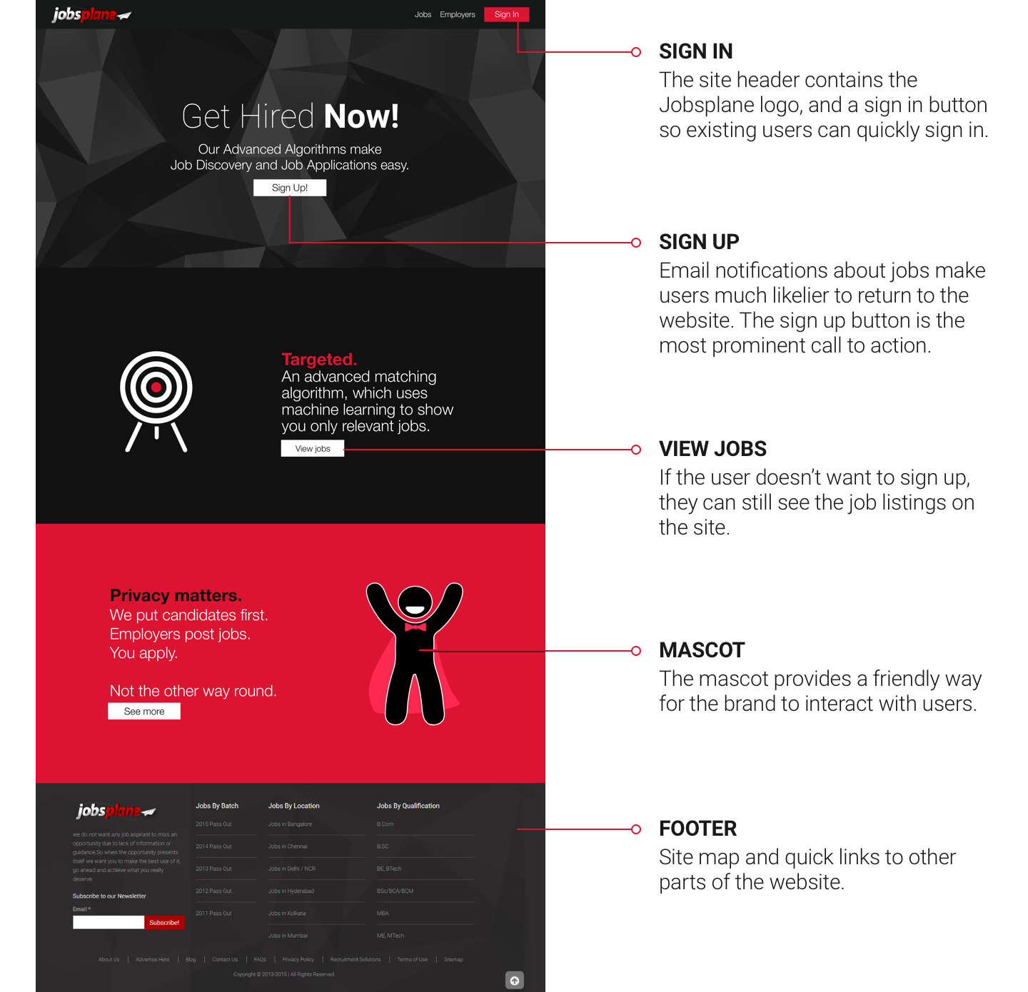
The Jobsplane website did not have a landing page — first time users were directly lead to job listings, and if they tried to apply for a job, they would be asked to sign up or sign in. I created a landing page that explained the core ideas behind Jobsplane, and created an onboarding process for first time users.
Mobile App
I worked on a design for Android, with an iOS app planned for a later date.
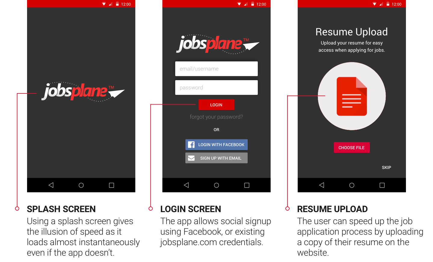
Login and Resume upload
After signing in, the user starts filling out their details. If they are already a Jobsplane.com user, their data will be auto-filled from the website database.
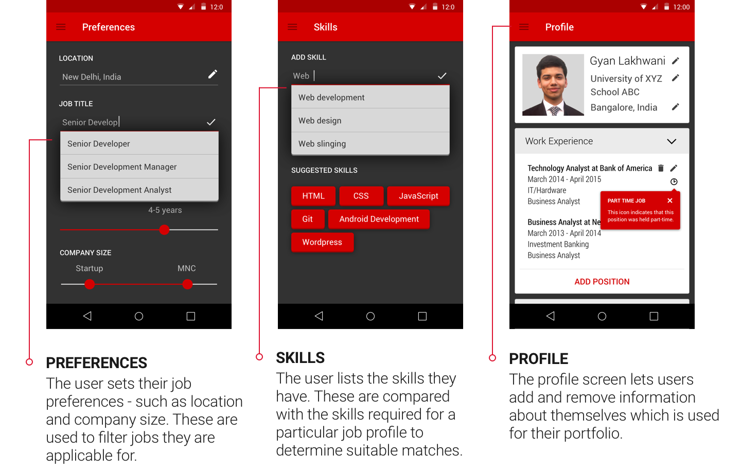
Preferences, skills and profile.
Jobsplane creates a database of jobs, and uses machine learning algorithms to match users to the best possible jobs for them. To help users apply for the right jobs, the UX for the app needed to be radically different from the website. While the website aimed at showing users all of their options and letting them pick the jobs they were most interested in, but this quickly got overwhelming on mobile.
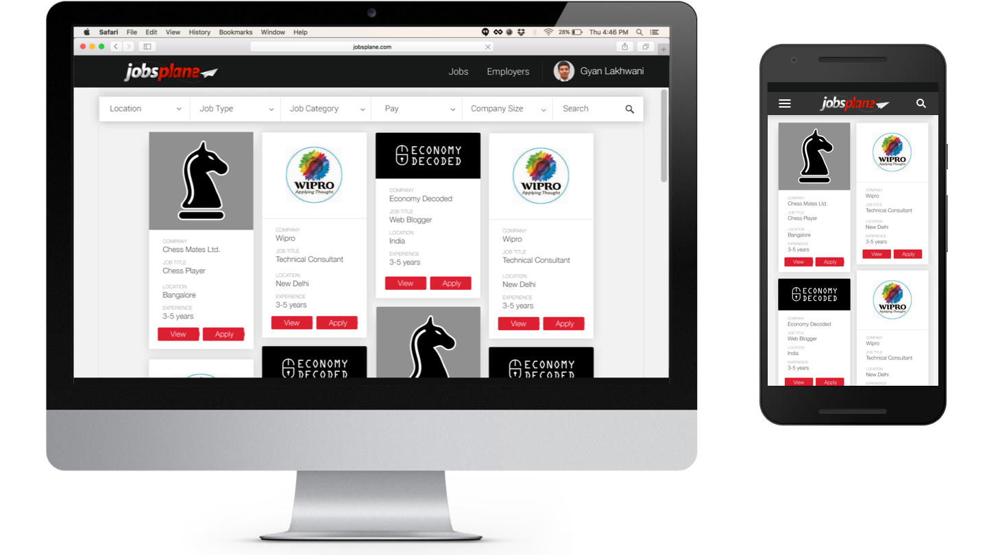
The larger screen area on desktops and laptops can be used to show multiple jobs at a time. On a phone-sized screen, however, this leads to an unpleasant, cluttered interface.
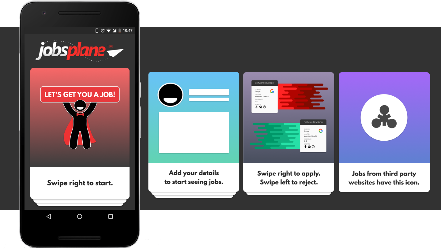
The solution, then, was to show the user only one job at a time. The app curates the jobs most suitable for the user, and these jobs are then shown sequentially to the user. The user can choose to apply for the job, or ignore it. I tried a few different ways to show a list of jobs, and eventually settled on Tinder-style cards which could be swiped left to reject the job, or right to send an application.
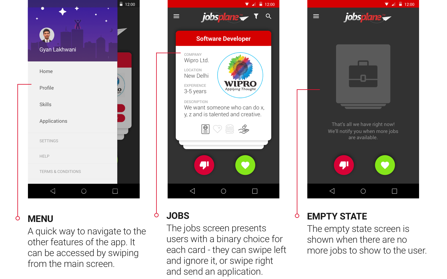
Home screen and menu
The problem with this approach was that not all users would be familiar with the swiping gesture. I decided to use the onboarding process as a small training exercise. Instead of the a full-screen onboarding, we used the same swipeable cards as the jobs screen. The first card instructs you to swipe right to begin, and the user learns that cards can be swiped away.