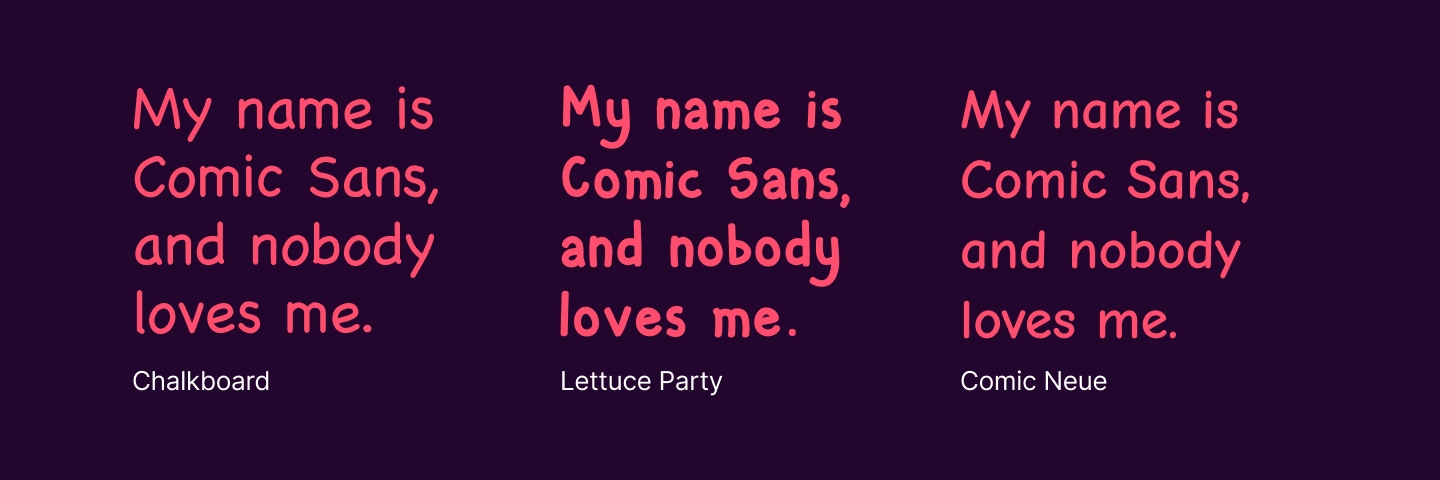
Comic Sans
The font everybody loves to hate.
Most people don’t care about fonts. To them, a font is a utilitarian thing—if other people can read what you wrote, what does it matter what font it’s in? I find this line of thinking in poor taste, because I personally think fonts are great, and enjoy spending a lot of time looking at them and trying to pair them up with each other.
Some fonts make it into the cultural zeitgeist—like when Ryan Gosling got really mad about the poster for Avatar using the Papyrus font. These moments can be fun, but people on the whole tend to not think about any given font for too long. Except perhaps Comic Sans, which has been in the unenviable position of being a joke in the public eye.